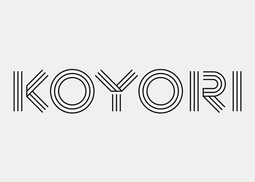
KOYORI’s brand identity including the logo, was formed under the watchful eye of the iconic British product and furniture designer, Jasper Morrison, in the role of Art Directing Advisor also co-designed by graphic designer Sebastian Fehr.
As a new brand, it was no doubt that executive director Koda was willing to appoint one of the most trusted designers for the logo design. He has been feeling a great sympathy for Jasper’s perceptions and the aesthetics of lines such as the combination of curves and straight lines that he has been creating over his career. In addition, having lived in Japan for quite a long time, Koda believed that Jasper had a strong affinity to Japan. Being a brand that aims to embody the true Japanese Aesthetics, it was a significant aspect.
KOYORI ANECDOTES
WHY CHAIRS?

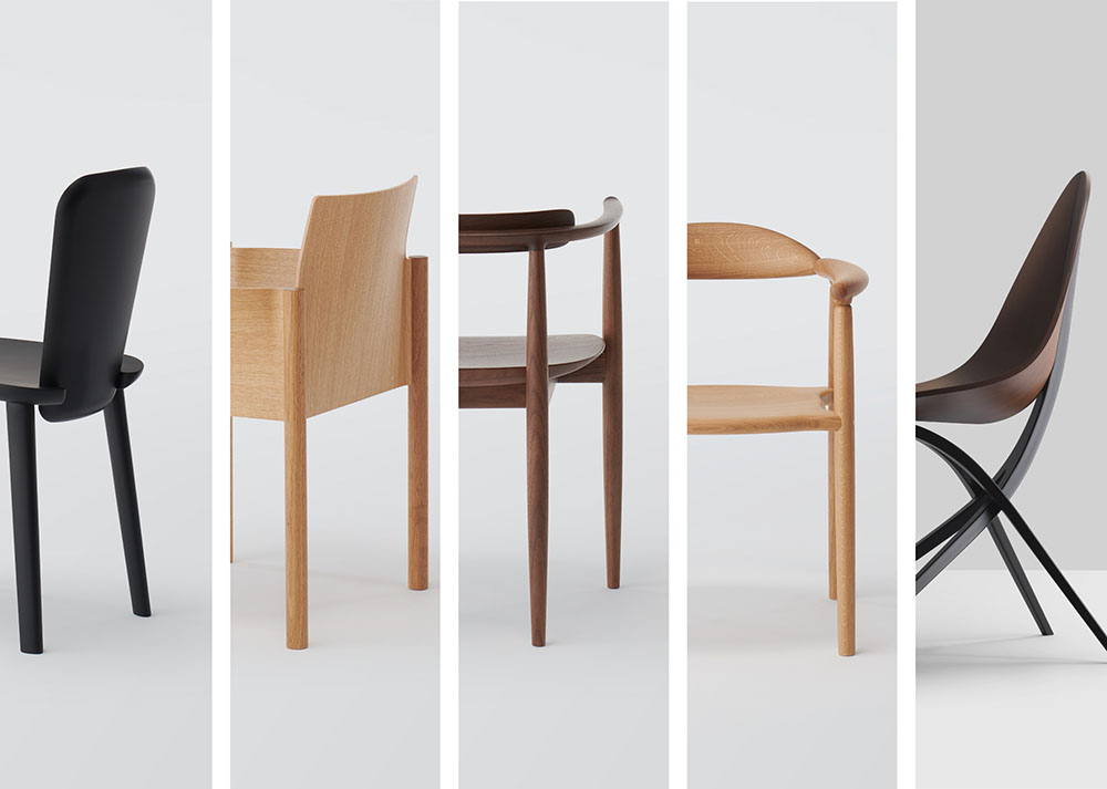
KOYORI debuted in 2022 with 5 different models of chairs, each piece unique and full of character.
KOYORI is an alliance brand formed by leading Japanese furniture manufacturers, each one of them bringing their own manufacturing peculiarities.
The two manufacturers who participated in the project for the launch, specialize respectively in solid bentwood furniture and molded plywood and both have long histories and knowledges in producing excellent dining furniture.
Among dining furniture, a chair can explicitly showcase the KOYORI brand with strength specialized in wooden furniture.
Kawara armchair and Edaha chair, designed by Ronan & Erwan Bouroullec and GamFratesi respectively, exploited the possibilities and aesthetics of what a plywood furniture can bring.
Musubi armchair and Shaku chair designed by the Bouroullecs and Miau armchair by GamFratesi are made of solid wood, expressing fully in their own ways, the tactile and soft texture of the nature of wood.
BRAND VISUAL IDENTITY

KOYORI’s brand name was named after a Japanese word which stands for 'twisted paper cords' and is the main material of Mizuhiki, the durable and decorative paper strings traditionally used in Japan for wrapping gifts, especially on festive and ceremonial occasions. Based on the brand name and the concept, Jasper and Sebastian started the logo design process by individually gathering ideas and sketches, which followed multiple online talks and emails.
“The creation of the KOYORI logo was a very good and focused exchange of ideas between Jasper and me over a few weeks of time span. Luckily, both our inputs went along well, and the result was not a compromise but a synergy that elevated both our individual approaches,” says Sebastian Fehr.
Correspondingly, the identity of the logo became quite open to interpretation: Paper strings, folded paper, wooden fiber, and the idea of the alliance. This is why the logo can transform itself to many visual identities evoking the viewers’ thoughts: hint of a Mizuhiki knot, serenity of a stone garden, and more.